10 The Velvet Underground – The Velvet Underground & Nico
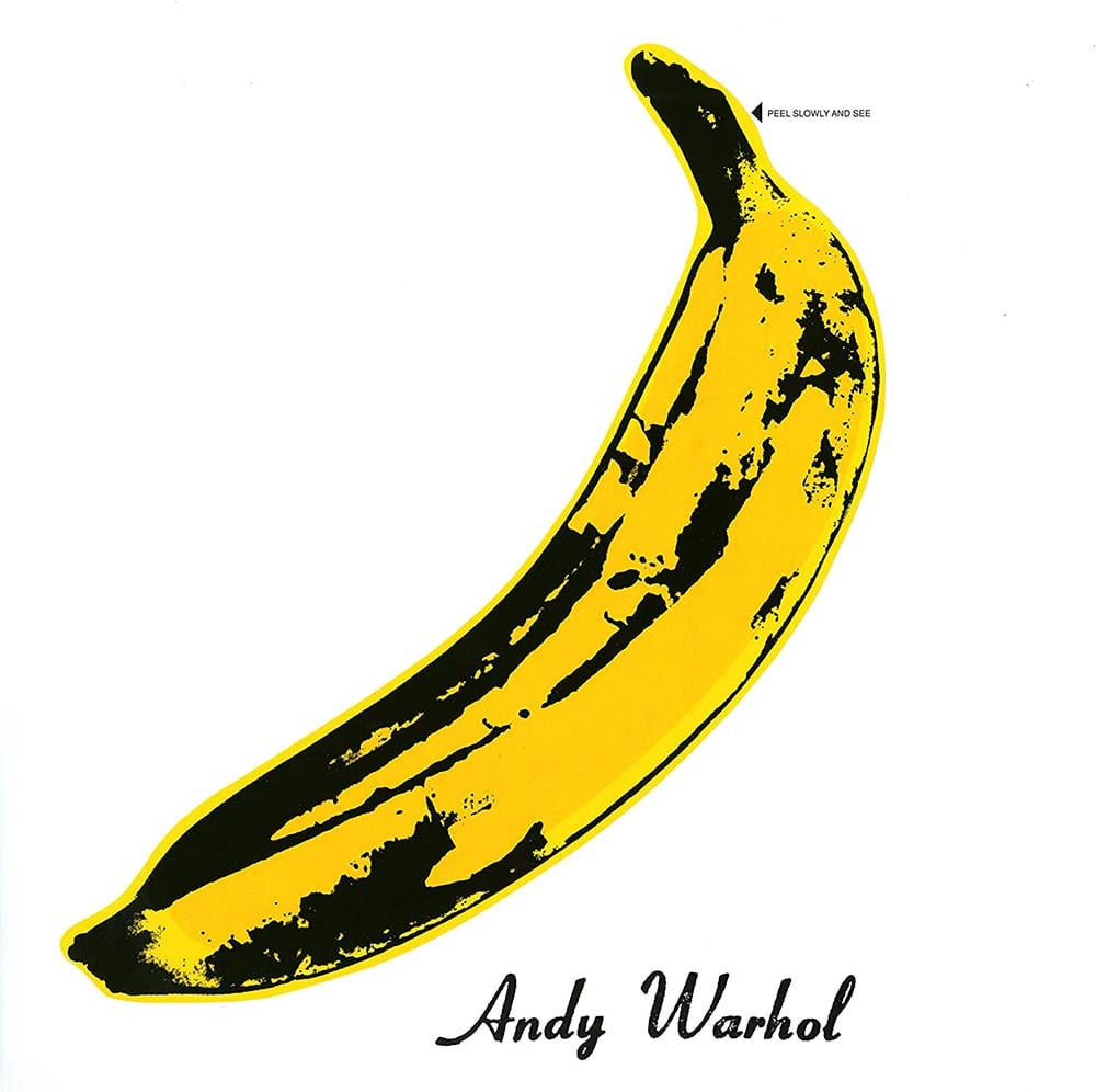
The album artwork for The Velvet Underground & Nico is instantly recognizable for its Andy Warhol banana print on the front cover. The famous pop artist was, at the time, both mentor and manager for The Velvet Underground and incidentally helped to finance the recording of the album.
Early copies of the album had a rather suggestive sounding instruction on the front, inviting the owner “Peel slowly and see”; pulling off a banana peel sticker revealed a flesh-colored banana beneath. (Re-issues of the album did not feature the sticker until a 2008 vinyl re-release. The 1996 CD release featured the peeled banana inside the jewel case underneath the CD.) A special machine was required in order to manufacture the album covers, causing the release date to be delayed. MGM, however, willingly paid the costs with the assumption that any ties to Warhol would help boost record sales. Unfortunately this was not the case. Upon its original release The Velvet Underground & Nico was a financial failure. It was banned from numerous record stores and many radio stations refused to play the album due to its controversial content.
After a mere two months at the bottom of the Billboard 200 Album Chart, the album fell off the chart for nearly five months when it was recalled because of a lawsuit over an unauthorized image. The back cover of the album featured a picture taken at an Exploding Plastic Inevitable show (a multimedia event organized by Warhol) of an image of actor Eric Emerson projected upside down on the wall behind the band. Emerson wanted to be paid for the use of his picture but rather than comply, MGM recalled copies of the album and halted the distribution. Any copies that had already been printed had a large black sticker placed over Emerson’s picture and the image was airbrushed out on subsequent pressing. Interestingly enough Emerson’s image was restored for the 1996 CD re-issue.
Though the album was a considered a complete commercial failure upon its original release, over the years it has gained quite a cult following and is now considered one of the most influential and critically acclaimed rock albums of all time.
10 Classic Rock Songs That Inspire Baby Girl Names
9 Queen – A Night at the Opera

Queen’s fourth studio album, A Night At The Opera is the band’s magnum opus. Mike McGuirk of Rhapsody wrote, “Generally considered one of the greatest rock albums of all time, A Night at the Opera’s overlaying of heavy metal, genius stereo gimmickry, Broadway swish and British pomp is as vital and riveting to listen to today as when it was released in 1975.” With such songs as “Death On Two Legs”, “Love of My Life”, “Sweet Lady”, “The Prophet’s Song”, “I’m In Love with My Car”, “You’re My Best Friend” and of course, the incomparable “Bohemian Rhapsody”, the album is a brilliant amalgamation of four very different composition styles. It has been a fan favorite since its release and is arguably the best Queen album ever.
The simple, yet eye catching cover for A Night At The Opera was created by David Costa and was actually a lavish take on Freddie’s original Queen Crest. The design was updated, brilliantly colored then placed in the center of a bright white background with the band’s name and album title written in an elegant script beneath. For the first time the inner sleeve was printed in color and featured live photos from their last tour. The gatefold design also complimented the style of the cover with the lyrics printed across two sides of the inside cover.
An instant commercial and critical success, A Night At The Opera is Queen at their finest.
8 Bruce Springsteen – Born to Run
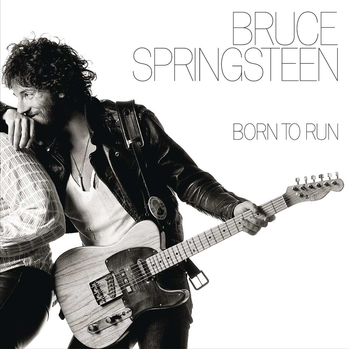
Eric Meola’s photograph of Bruce Springsteen holding a Fender Broadcaster while casually leaning against saxophonist Clarance Clemons has become one of rock music’s most popular and often imitated images. The chosen picture was one of over 900 that were shot in a three hour session, which apparently started out quite badly. Springsteen was uncomfortable with the static poses – listening to the radio, standing beneath fire escapes – that Meola set up. The tension finally broke however, when the two friends began to do what they did best: they began to jam. The magic moment happened when the Boss paused to let the Big Man take a solo.
The designers at Columbia added mystery to the cover art by wrapping it around the album – Springsteen on the front and his sideman wrapped around the back. The high contrast photo was placed on a white background with ultra-thin black lettering.
Born to Run was Springsteen’s breakthrough album and helped him reach mainstream popularity. It is on the Library of Congress’ National Recording Registry of historic recordings and was ranked as #18 on Rolling Stone’s “500 Greatest Albums of All Time” list.
12 Most Influential Live Classic Rock Albums
7 Led Zeppelin – Houses of the Holy
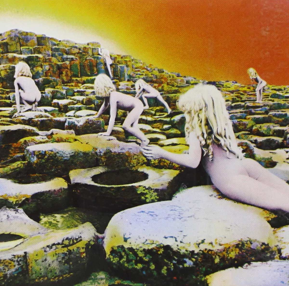
The title for Led Zeppelin’s Houses of the Holy was a nod to their fans who appeared at venues they dubbed “Houses of the Holy”. The cover however, was inspired by a scene in the Arthur C. Clark Sci-Fi novel Childhood’s End – the scene involves hundreds of naked children who have evolved to the “penultimate form of human evolution” but physically, they have only a passing resemblance to the human race.
The cover art is a collage of photographs taken at the Giant’s Causeway in Northern Ireland, by Aubrey Powell of Hipgnosis. The shoot took place over the course of ten days and was reported to have been a frustrating affair. The goal was to capture the light at dawn and dusk but due to constant rain and clouds, the desired effect was never achieved. Only two children actually modelled for the album cover so, the photos were multi-printed to create the image of the 11 individuals that can be seen on the cover. Shot in black and white, Powell was less than thrilled with the result. Luckily, an accidental tinting in the post-production process ended up creating the final striking image used on the album cover.
As with Zeppelin’s fourth album, neither the band’s name nor the album titled was printed on the cover. In compromise, they did allow Atlantic Records to package the UK and US copies of the record with a wrap-around paper band printed with the album title, which had to be removed in order to access the record. This also hid the children’s naked buttocks from public display. Nonetheless, Houses of the Holy was banned or unavailable in numerous southern states for many years.
Houses of the Holy was nominated for a 1974 Grammy Award for the best album package.
Uncharacteristic of Led Zeppelin’s typical style, (the band experimented with other genres for the first time) the album received mixed reviews upon release. Commercially however, it was an unqualified success and reached Number 1 in both the US and the UK.
6 The Rolling Stones – Sticky Fingers
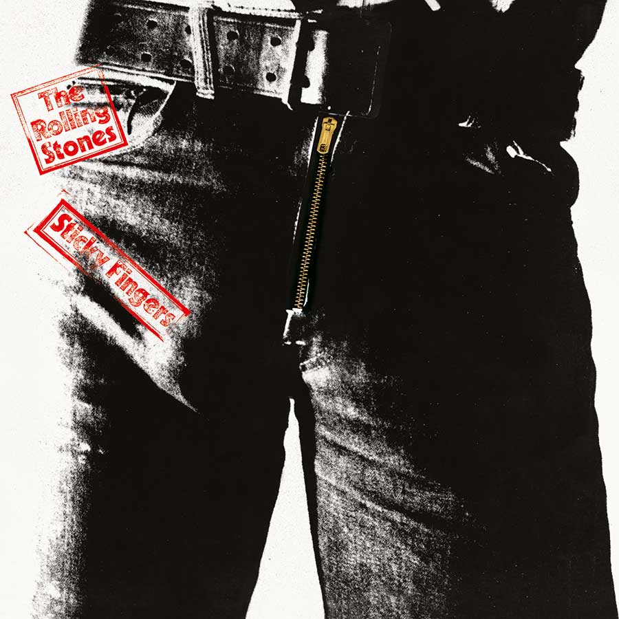
Overtly sexual, the close-up of the jeans-clad man in his current state of… interest on the album cover leaves no doubt as to the suggestive innuendo behind the title of the Rolling Stones record Sticky Fingers.
The Peter Webb photograph of a man in white briefs, found on the inside of the original release, was at first intended to be the cover photograph. Then Andy Warhol got involved. The famous pop-artist collaborated with designer Craig Braun and photographer Billy Name to create the infamous album cover. The original vinyl release featured a mock belt buckle and a working zipper that opened to reveal the cotton briefs in behind. Underneath the zipper, Warhol’s name appeared to be stamped in gold ink while the band’s name and album title were printed on the front, along the image of the belt.
Though many fans assumed that the man on the cover was Mick Jagger, those involved in the photo shoot claim that Warhol used several different men as models, none of whom were Jagger. Warhol never revealed whose image he used. However, the other people involved in the shoot and design have suggested that Factory artist and designer Corey Tippen is the likeliest candidate and it has been surmised that the man in the briefs on the inside was actually a different person – possibly journalist Glenn O’Brien. Unfortunately the zipper caused damage to the vinyl when it stacked for shipment. After many complaints from retailers the zipper was unzipped to the middle of the record in order to minimize the damage. Later pressings dispensed with the actual zipper altogether.
Sticky Fingers features the band’s first use of their now trademark “tongue and lips” logo, which fit perfectly with the album’s suggestive theme. Originally created by Ernie Cefalu, the design used on the album was actually illustrated by John Pasche, though Cefalu’s version was used for much of the merchandising.
A number one album in both the US and the UK, Sticky Fingers was certified 3x platinum in the US and includes the hit songs “Brown Sugar” and “Wild Horses”.
5 Led Zeppelin – Led Zeppelin
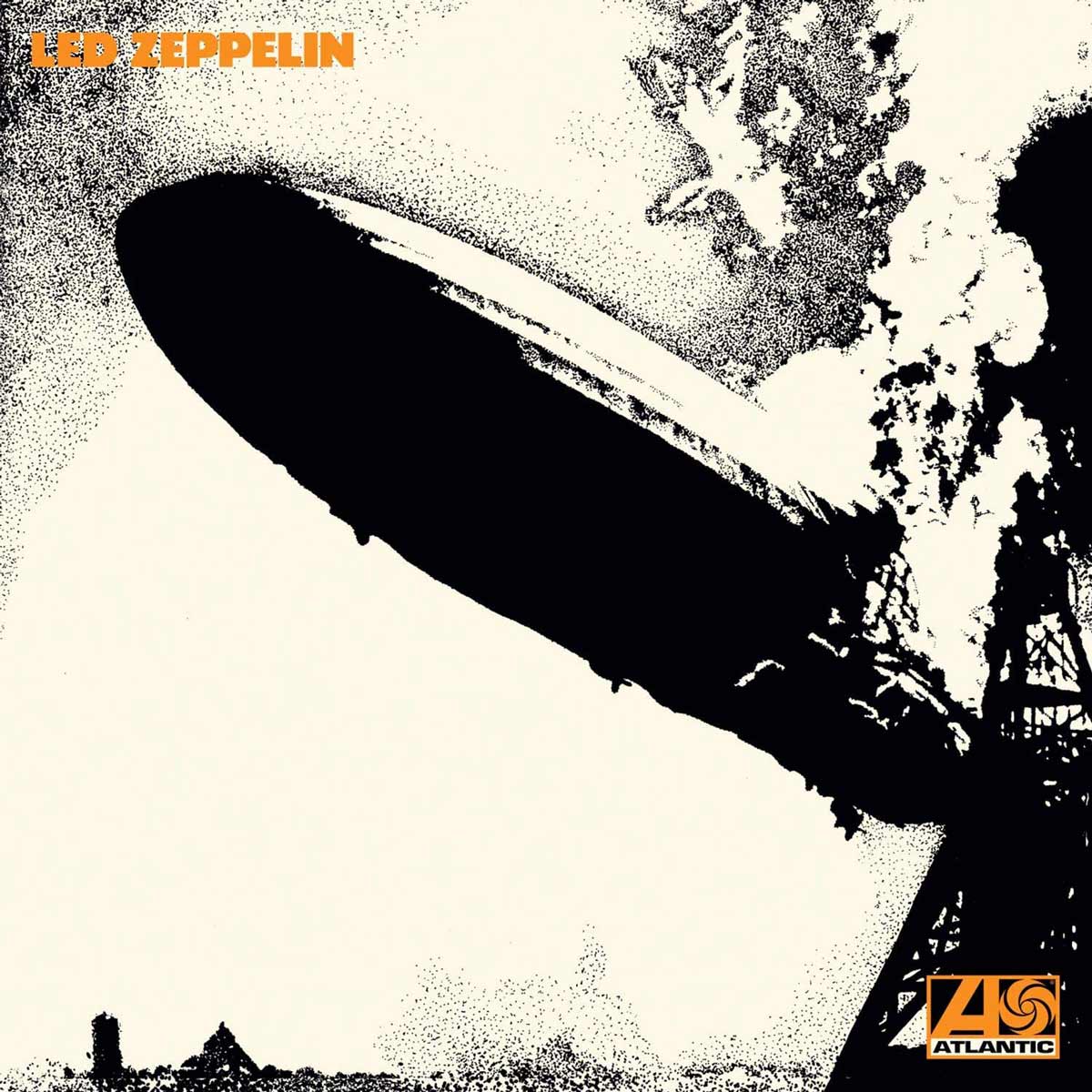
The familiar cover of the self-titled debut album from Led Zeppelin depicts a black and white image of the burning Hindenburg airship. Designed by George Hardie, the choice of the burning zeppelin refers to origin of the band’s name. As the story goes; Jimmy Page, Jeff Beck and The Who’s Keith Moon & John Entwistle were, at one time, discussing the idea of forming a band together, Moon joked that the group “would probably go over like a lead balloon” and Entwistle chimed in, “…a lead zeppelin!” Though the final line-up for the band differed quite drastically from that group of musicians, the name stuck.
The album cover chosen by Jimmy Page was not the original image Hardie had in mind when designing the album art. His first offering to the band (based on an old club sign in San Francisco) was an image of an overtly phallic zeppelin airship flying through clouds. Though Page declined the use of the design for the front of the album, the band used it on as the logo for the back of both their first and second albums as well as many of their early press advertisements.
The now famous front cover received widespread interest when the band travelled to Copenhagen in 1970. Eva von Zeppelin – a relative of Zeppelin aircraft creator Count Ferdinand von Zeppelin – was incensed by the the band’s name along with the logo of the burning airship and threatened legal action. As a result the band were billed as “The Nobs” for the Copenhagen show and the album received even more attention.
“The cover of Led Zeppelin…shows the Hindenburg airship, in all its phallic glory, going down in flames,” wrote Rolling Stones Greg Kot in 2001. “The image did a pretty good job of encapsulating the music inside: sex, catastrophe and things blowing up.”
Incidentally, when Led Zeppelin was first released in the UK the band’s name and the Atlantic logo were actually printed in turquoise but shortly thereafter the print was switched to the now familiar orange. The turquoise-printed sleeves are rare and have become quite a collector’s item.
Initially receiving poor reviews from critics, the album was very successful commercially and earned Led Zeppelin a vast and loyal following.
4 Pink Floyd – Wish You Were Here
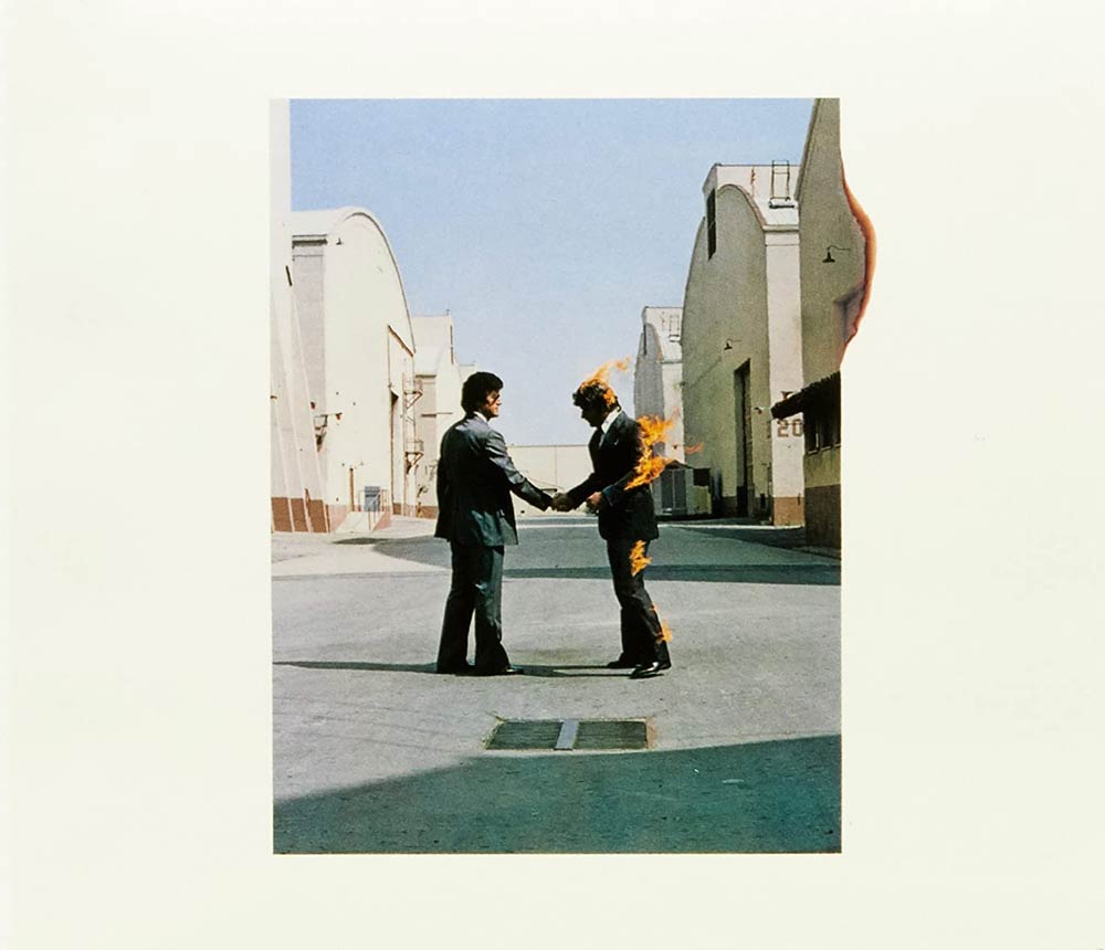
In order to create the album art for Wish You Were Here, Storm Thorgerson of acclaimed art design group Hipgnosis spent long hours brainstorming with the band, studying the meaning of the lyrics and even accompanying the band on their 1974 tour. The result is one of the most elaborate and carefully constructed packages to accompany a Pink Floyd album.
The Hipgnosis design team did a stunning job of visualizing the album’s theme of absence, using four photos for the album jacket and sleeve each incorporating on one of the four basic elements: earth, fire, air and water. Furthering the concept of “unfulfilled presence”, the LP was then wrapped in a dark opaque plastic, making the album, in a sense, absent. On the outside of the plastic they placed the now-familiar logo of the mechanical shaking hands to symbolize a gesture that should convey warmth and sincerity but is more often a cold, disingenuous act. Behind the hands is a quartered circle showing each of the four elements.
Covering the true album art with the opaque plastic freed the designers from constraints and allowed them to be as creative as they wished. Because the cover wouldn’t been seen on store shelves, it could hardly be responsible for selling, or not selling, the album. This artistic freedom helped to create one of the most memorable rock album covers ever. Inspired by the idea that most people hide their true feelings, for fear of “getting burned”, the front cover showed picture of a man shaking hands with a his Doppelgänger. “Getting burned” was also a phrase commonly used in the music industry, referring to the denial of royalty payments to artists. Equally evocative is the photograph on the back cover, featuring the faceless “Floyd salesman” in the desert. His lack of wrists and ankles signifies him as an “empty suit” who is, in Thogerson’s words “selling his soul”. The inner sleeve features two other photographs, a veil seemingly suspended in mid-air in a windswept Norfolk grove and a splash-less diver at Mono Lake in California.
Columbia Records, Pink Floyd’s US record company, was less than thrilled with the decision to shroud the album in black plastic and insisted that it be changed. They were over-ruled. The band, however, was quite pleased with the end product and even applauded the designers after being presented with the pre-production mockup.
Wish You Were Here was an instant success upon release and EMI was unable to print enough copies of the album to keep up with the demand. Richard Wright and David Gilmour both stated that Wish You Were Here was their favorite Pink Floyd album.
Backstage Access:
Storm Thorgerson – Greatest Album Cover Artist and Designer of All Time
3 The Beatles – Abbey Road
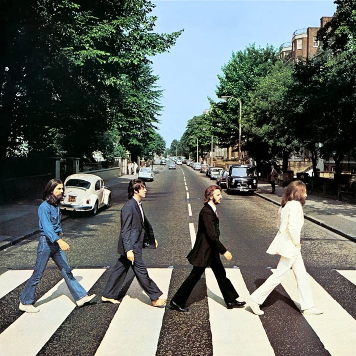
The iconic Beatles photo on the Abbey Road album cover was captured by photographer Iain Macmillan on August 8, 1969. With the police holding up the mid-day traffic, Macmillan had only ten minutes to get his shot as he perched on a step-ladder in the middle of the road.
The photo chosen for the album cover features the band traversing a zebra crossing in single file from left to right. Lennon leading, followed by Starr, McCartney and Harrison. The first three Beatles were clad in Tommy Nutter suits while Harrison was more casually dressed in jeans and a blue chambray shirt. While this difference didn’t seem to merit much notice, the fact that McCartney was barefoot in the photo added fuel to the “Paul is dead” rumors.
On the left side of the picture, parked near the zebra crossing is a white Volkswagen Beetle which belonged to someone who lived across from the recording studio and was therefore frequently parked in that spot. After the album was released, the license plate – LMW 281F – was repeatedly stolen from the car. In 1986 the car was sold at auction for £2,530 and in 2001 was put on display in a German museum.
The concept for this often imitated photo was based on sketches by Paul McCartney with the sleeve designed by Apple Records creative director Kosh. It is the only original UK Beatles album to depict neither the band’s name nor the album title on the front cover.
The Abbey Road zebra crossing has become such a popular destination for Beatles fans that a webcam has been set up and anyone can take a peek at the famous location by visiting abbeyroad.com/Crossing. In December 2010 the crossing was granted grade II listed status for its “cultural and historical importance”.
Debuting at number 1, Abbey Road continues to be a fan favorite and was ranked 14th on Rolling Stone magazine’s list of the “500 Greatest Albums of All Time”.
10 Most Romantic Classic Rock Love Songs
2 Pink Floyd – Dark Side of the Moon

When Pink Floyd keyboardist Richard Wright requested a “simple and bold” design for the band’s eighth studio album, one of the most instantly recognizable images in rock music was born. Designed by Storm Thorgerson and Aubrey Powell of Hipgnosis with artwork by George Hardie, the famous Dark Side of the Moon prism was reportedly inspired by a photograph that Thorgerson had seen during a brainstorming session. According to Thorgerson, Hipgnosis spent weeks coming up with a variety of different ideas for the cover but it took the usually disputatious band “less than three minutes” to agree upon the now-famous album cover.
The idea behind the prism was to celebrate the band’s light show. Pink Floyd has always been known for their elaborate staging and use of visual effects but none of their previous album covers had reflected that in any way. The choice of the triangle was also symbolic. In a recent interview with Rolling Stone, Thorgerson explained: “I think the triangle which is a symbol of thought and ambition, was very much a subject of Roger’s lyrics.” The refracting prism also hints at the psychedelic rock style found on the album.
Frequently ranked as one of the best albums of all time, The Dark Side of the Moon remained on the charts for 741 weeks from 1973 to 1988, longer than any other album in music history.
Watch:
David Gilmour Discusses ‘Dark Side of the Moon’ with CDJ’s Paul Rappaport
1 The Beatles – Sgt. Pepper’s Lonely Hearts Club Band

It is no surprise that Sgt. Pepper won the Grammy Award for Best Album Cover in 1968. The iconic album art is one of the most widely recognized and highly acclaimed album covers of all time. Designed by Peter Blake and his wife, Jann Haworth, the cover features an eclectic array of life-sized cardboard models of famous people with the Beatles themselves front and center, dressed in the guise of the Sgt. Pepper Band.
As the Sgt. Pepper Band, the Fab Four wore military-style costumes made of day-glo colored satin, custom made for them by designer Manuel Cuevas. Decorating the uniforms were a variety of insignia including: MBE medals on McCartney and Harrison’s suit jackets (all four Beatles had received MBEs), The Royal Coat of Arms of the United Kingdom on Lennon’s right sleeve, an Ontario Provincial Police flash on McCartney’s sleeve, and a variety of family medals borrowed from ex-Beatles drummer Pete Best’s family.
What makes this album artwork most interesting though, is the colorful collage surrounding the band. Photographed by Michael Cooper, the album cover depicts more than 70 different celebrities, incorporating writers, musicians, film stars, famous doctors, scientists and even a number of Indian gurus (inlcuded, of course, at the request of Harrison). With much input and debate from the band, Blake’s final design features the images of such people as: Marlene Dietrich, Carl Gustav Jung, Mae West, Fred Astaire, Bob Dylan, James Dean, Edgar Allan Poe, Marilyn Monroe, Aldous Huxley, Sigmund Freud, Albert Einstein, Marlon Brando, Stan Laurel and Oliver Hardy as well original Beatles bassist, Stuart Sutcliffe, to name a only few. With a cost of £2,868 5s 3d, it is estimated that the album artwork was nearly 100 times the average cost of an album cover in those days.
The album itself was an instant hit with both fans and critics. It is widely recognized as one of the most important and influential albums in the history of popular music, consistently ranking at, or near, the top of any published list of the greatest albums of all time.


